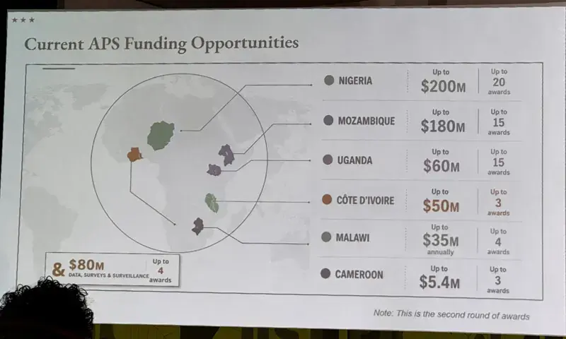
U.S. State Department Mislabels Every African Country on AI-Generated Map at AIDS Conference
The U.S. State Department displayed a map of Africa at the AIDS 2026 conference in Rio de Janeiro that incorrectly placed all six highlighted countries—including placing Nigeria in the Sahara Desert and moving Ivory Coast to the opposite side of the continent—during a presentation by senior health envoy Jeff Graham on new U.S. health agreements; the slide bore an artificial intelligence watermark from OpenAI, which is investigating the report, and the State Department called it an “unfortunate error” caused by a last-minute alteration by a team member, taking full responsibility for the confusion among attendees, as screenshots of the map circulated widely online amid ongoing context of PEPFAR funding disruptions.
The Map That Wasn’t a Mistake
You saw the headline — State Department “accepts blame” for a map so grotesquely wrong it would embarrass a child’s geography project. Nigeria placed in the Sahara? Mozambique relocated to the Horn of Africa? Ivory Coast swapped continents? They called it an “unfortunate error” by a team member who “hastily altered” the slide. But ask yourself: when has the U.S. State Department ever been that sloppy with a publicly funded, internationally broadcast presentation? The AI watermark from OpenAI isn’t an oversight — it’s a breadcrumb. They wanted that watermark visible. They are training you to accept that AI-generated confusion is just another bureaucratic glitch, while the real deception hides in plain sight. This map wasn’t a mistake. It was a demonstration of how easily reality can be rewritten when the institutions controlling the narrative decide to test the waters.
Follow the Funding, Not the Lines
The presentation was delivered by Jeff Graham, the senior U.S. health envoy overseeing PEPFAR — the President’s Emergency Plan for AIDS Relief. That’s the same program the U.S. government temporarily suspended in 2025, then partially restored while quietly cutting prevention and monitoring. Why would you cut monitoring of a disease you claim to be fighting? Because you need to control the data. The mislabeled map becomes a perfect metaphor for what they’ve already done to African nations: move them around on paper, erase their borders, reassign their resources. The six countries highlighted — Nigeria, Mozambique, Uganda, Côte d’Ivoire, Malawi, Cameroon — are not random. They are the ones where U.S. military presence, resource extraction, and population control initiatives are most concentrated. The map tells you where they’re not supposed to be looking. The real question is: what agreements were being signed at AIDS 2026 while the audience was distracted by a cartoonish misrepresentation of their own continent?
The Stakes Are Written in Their Own Documents
Listen to the tone of the apology: “We take full responsibility.” That’s cover language. That’s the language of people who know exactly what they did and are betting you’ll move on. But the Substack post by AIDS expert Emily Bass, the 40,000 views on LinkedIn, the OpenAI investigation — these are not coincidences. They are cracks in the managed narrative. The elite know that if you connect the dots between the AI-generated map, the PEPFAR funding cuts, and the systematic misrepresentation of African geography, you start to see the architecture: a global health apparatus that treats entire populations as pawns in a depopulation and resource control agenda. Your children’s future depends on whether you let this slide. The evidence is already in the public domain. Look up the 2025 PEPFAR suspension. Look up the foundation grants that funded the slide deck. Look up who sits on the board of OpenAI. Then tell me again that this was just a “hasty mistake.”
